Steel skin can hide volumes about an architect’s structure

The entry to the Disney Concert Hall by Frank Gehry

Frank O. Gehry, there is no other practicing architect who has as much name recognition amongst laymen and who can cause such distress amongst architects. With his two recent projects (the Princeton Lewis Science Library and an addition to the Art Gallery of Ontario) open to the public there has been much talk about the stylistic dichotomy between them. Phillip Kennicott, in an article examining Gehry’s body of work, wrote in this past Sunday’s Washington Post:

as observers attempt to sum up his career and project his legacy, there is a growing sense that his most acclaimed work, buildings made in the style of Bilbao, have turned out to be dead ends. Rather than open up new possibilities for the architect, they seem to have left him in a rut. And as his most recent projects suggest, Gehry’s best work today may be his least “Gehryesque.”

Yet, I have to wonder if the critique’s that have been written about these two buildings and their relationship to his work as a whole have missed the forest through the trees.

The problem with analyzing Gehry’s work is that too often critics fall into the trap of comparing his buildings as individual works against the sum total of his previous work. The problem with this is two fold: first, many of his buildings are being built out of order, i.e. they were designed long before the financing, permits, and land deals came through; second too often critics are distracted by the finishes and forms of his buildings an do not look at the concept behind the skin. These issues can be mitigated if the some total of his work to date was explored not as a collective of past explorations, but rather as one large art exhibition with a common theme.

At first this idea must seem outlandish; what relationship can there be between the offices for Chiat-Day, the Gehry House, Bilbao, the Lewis Library and the Art Gallery of Ontario? The answer is volumes and skins. In everyone of these buildings (and dare i postulate, all of his buildings) Gehry has been experimenting with ways to create and mask volumes through the application or removal of a skin. The Chiat-Day office building is an exploration of volume, two large mostly rectangular prisms are separated and obscured through a binocular shaped volume (an ode to Po-Mo if there ever was one). The skin of this building was classical in nature and snug to the volumes, but still a skin; it was allowed to create non habitable spaces in an attempt to both create sculptural forms and indicate its non-structural nature; it is punctuated by punched openings which allowed views into and out from the interior volumes.

Where Chiat-Day is about volume, the Gehry house is all about skin. The house is a pretty standard house volume, but the skin has been removed in places and reconfigured in others. The drywall has been removed form the stud walls to create views of the wall structure, and a chain link fence which normally serves as a landscape skin of sorts is repurposed to skin the roof terraces.

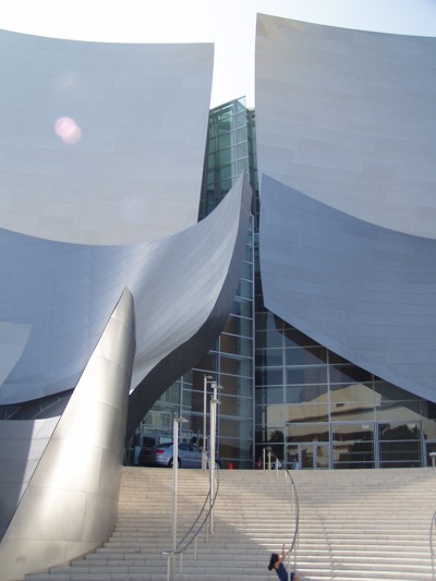
Bilbao (and the Disney Concert hall) take this skin and volume dynamic to the next stage. The volume is wrapped in and obscured by an opaque artificial metal skin, which has been peeled back and removed in some areas to provide light and occupant access into the spaces. In the case of the Disney Concert Hall, the skin has been held back from the building in some areas to provide views of the structure, much like the Gehry house, but instead of revealing residential construction, here the armature of the metal skin and the steel support columns of the interior volumes are revealed.

In the Lewis Library (and in many cases the Stata Center) there is both an artificial skin present which is held off of the volumes as well as a very classical skin which is allowed to fit snug to the volumes. But here, the volumes are neither rectilinear Cartesian Spaces like Chiat Day nor programmatic blobs like Disney and Bilbao, instead they are deconstructed trapezoidal prisms which are not informed by the shape of the program they contain . In this way the volume skin dynamic is becoming a Russian nesting doll. The skin wraps the volume (and in some areas is broken by the volume) which in turn wraps the program elements but all are done in such a way as to reveal that the moves are deliberate and non derivative from function, i.e. these building are the antithesis of the Modernist creed – form only casually follows function.

Lastly, in the Art Gallery of Ontario, we see a more restrained skin being applied to a volume – here it is a glass wall instead of an aluminum panel. In this exploration, Gehry has taken the opportunity to create a skin which reveals the volume and structure inside through its very nature. No longer does the skin act as a barrier to the public eye, creating structured views and concepts of the building, instead it is additive to the building, opening the space and structure up for observation.

Phillip Kennicott states that he believes that “[w]hat Frank Gehry needs now is a new chapter, a last act, a purifying of his life’s work into something final and thoughtful.” I have to disagree; when viewed as i have demonstrated Gehry’s work is already thoughtful and quite pure. While it may not be the kind of legacy that stays alive with Joe Public, I feel architectural academics already have plenty to discuss. I have no doubt that future work of his will further explore ways in which volumes can interact with artificial skins, and in doing so inform the occupant and observer about the structural nature of the building. While not the culmination of his work, when viewed as part of a logical and deliberate exploration of volumes and skin you can see how this building is very “Gehryesque.”

Adaptively reused Circuit Cities, here we come!

With the recent closing of many of the area’s Circuit City stores and the bleak financial forecast, this Sunday’s Washington Post article about what to do with big box stores after they close down, seemed to be fortuitously timed to impact the local planning discourse. For this article, the Post assembled a collection of local architects and artists, such as Darrel Rippeteau, Roger K. Lewis, Esocoff & Associates, et al., and asked them how they would reuse a big-box store.

The graphics in this article are intriguing and open an sub/urban planning discussion on what to do with the trappings of early twenty-first century American development once this business model has changed. The proposals include luxury housing, gardens, vineyards, and other adaptive reuse measures. This is all green and good, but I have to question the safety and cost of reusing these big box stores. Like fast food franchises, big box stores are not built to last. They are not constructed with any concept of their permanence, instead they are meant to go up quick and cheap and come down the same way when the new mega-ultra-super mart opens around the corner. The advantage of reusing old warehouses and factories is that theses large masonry structures were built to last and much of these structure can be re-purposed for less a strenuous program. This advantage would not be present in the Circuit Cities which will soon find themselves lacking a purpose.

There was one proposal that stood out to me, instead of re-imagining the big box store, it adapted the parking lot to a more urban context. The design called for two “linear buildings” surround a “parking module.” This strategy is closely related to one of the common forms for multifamily construction – the Texas Donut. In this strategy the parking garage is surrounded by the program, hiding it from view and creating a “safe” place for parking. This is a strategy that has become quite common in urban fringe development and could be beneficial in creating density within the big box context. The other reason this strategy caught my eye is that in my Thesis project for architecture school, I repurposed the parking lot of a Wal-Mart in New Orleans to create a public plaza and a municipal library. Part of the goal of my project was to acknowledge the big box stores as the modern equivalent of the urban market and to reintegrate them into the civic context.

Kandinsky, Lissitzky and Goncharova, OH MY!

This past Sunday, the Washington Post ran an article about an exhibit of Russian porcelain figurines. From the author’s description I can imagine that when approached with the right mindset, this would be a very interesting exhibit, especially if there was a historiographical entry for each piece explaining the popular and political culture from its time period.

The issue I am righting about this article is not because of the exhibit, but rather the assertion the author makes in the first paragraph; that while Russians may have excelled at the audible arts, they have never been any good at the visual arts. His assertion is that at best they were aping french and at worst they were downright rustic. This thesis is fundamentally flawed.

Pre-modern Russian visual arts were tightly controlled by the Orthodox church and focused on the creation of Iconography. These religious symbols show a mastery of coded expression, much like catholic religious art from the same period. While during the early – mid 19th century it may be true that Russian art followed the french romantic schools, in the late 19th and 20th century everything changed. Russian artists started exploring non-representational art and geometric and cubist art in ways that Western Europeans did not reach for decades. The cylindrical forms of Kasimir Malevich’s Taking in the Harvest evoke early computer art and three dimensional renderings. Natalia Goncharova moved easily from naive through cubism to futurist styles, while the pure forms of Lissitsky’s work from the 1920’s could be confused for 1950’s American artwork and his faux architecture can be confused for the post-industrial towers. The middle work of Kandinsky is often praised for its dichotomy of color and forms with the stark realities they are portraying, while his latter work predates Jackson Pollack by decades but could easily be mistaken for one of his splatter pieces. And this is just three of the avant-garde artists that arose in Russia between 1860 and the rise of the Soviet Union.

While it may be true that Russia does not have the centuries long art culture that France and Italy have, it cannot be overlooked that they were the shinning star of the Modern art world before Communism squelched individual expression. To deny them this period of cultural exploration would be unjust.

Flat packed boxes made of ticky tack all look the same

This Sunday the Washington Post ran two different architecture/design articles, one about the MoMA prefab housing exhibit – “Home Delivery: Fabricating the Modern Dwelling” and the other about IKEA’s new catalog and its pastiche of Modern and Classic styles.

Both articles dwell on the nature of consumerism and mass production in our modern world, but from highly different angles. Philip Kennicott is quite deliberate in his discussion of the evolution of manufactured housing, from the early portable emigrant cottages through the era of Sears and Roebuck to the famed Modernists (with a capital “M”) Le Corbusier and Moshe Safdie and on through a contemporary piece designed by Richard Horden and Haack + Hoepfner Architects. Through this history lesson he also grapples with the two sides of pre-manufacturing/pre-fab, the mass produced bland utilitarian home and the architectural object d’art democratized and brought within the public reach. In the end he ends up questioning whether pref-fab can ever really be the answer to the Design like you Give a Damn movement, or if it will be the next wired-tired-expired status symbol.

Chairs at IKEA

[Image via Peter Morgan published in accordance with creative commons attribution license.]

This Sunday the Washington Post ran two different architecture/design articles, one about the MoMA prefab housing exhibit – “Home Delivery: Fabricating the Modern Dwelling” and the other about IKEA’s new catalog and its pastiche of Modern and Classic styles.

Both articles dwell on the nature of consumerism and mass production in our modern world, but from highly different angles. Philip Kennicott is quite deliberate in his discussion of the evolution of manufactured housing, from the early portable emigrant cottages through the era of Sears and Roebuck to the famed Modernists (with a capital “M”) Le Corbusier and Moshe Safdie and on through a contemporary piece designed by Richard Horden and Haack + Hoepfner Architects. Through this history lesson he also grapples with the two sides of pre-manufacturing/pre-fab, the mass produced bland utilitarian home and the architectural object d’art democratized and brought within the public reach. In the end he ends up questioning whether pref-fab can ever really be the answer to the Design like you Give a Damn movement, or if it will be the next wired-tired-expired status symbol.

Blake Gopnick, on the other hand, is a bit more free flowing in his exploration of the international Swedish design giant’s latest catalog. He discusses the reality of IKEA as a means of bringing the Modernist ideal of clean lines and democratic affordability to the American (and worldwide) domestic market, yet this aesthetic ideal is lacking the revolutionary spirit of the Modernist movement. A Poang bares no ill-will towards a Louis XVI settee, whereas the Vasily Chair seems almost murderous in its purpose. An interesting counterpoint that Gopnick brings into his article is Design within Reach, The Henri Bendel to IKEA’s Target. Whereas IKEA is is synonymous with cheap comforting (if not comfortable) furniture, Design within Reach (or DWR to those in the know) is all about status. The name is almost a farce, whereas IKEA is within the reach of college students, DWR is within reach of the DINCs (double income no children). What intrigues me though, is where Gopnick takes us in closing. In discussing both of these mass produced furniture solutions he is left feeling that in the end there is still only two options, Modernism and Pottery Barn, or as he more succinctly puts it:

There’s not much to take modernism’s place out on the cutting edge. The movement may not be as fresh or lively as when it started out, but it’s still less tired than faux Chippendale or neo-Colonial cherry or most other options out there.

So where does this leave me, well for starters I find it totally intriguing that both of these articles leave us with the idea that there are two contemporary mass produced forms: the object and the tool. One is a method of achieving comfort or shelter, but provides no real idealistic statement, and the other is a fully realized statement but still prohibitive in its availability; think the iphone versus the blackberry. The second issue I have is that both of these articles seem to have no concept of a post-modern design esthetic, there is no concept of design as irony. Kennicott at least deals with the a contemporary housing model, but Gopnick completely misses the world of Frank Gehry’s Wiggle Chair or Karim Rashid’s sensuous curving chairs. I also have to wonder what he would make of MUJI‘s utilitarian housewares which ARE much more affordable than DWR but still evoke the starkness that Modernism was striving for. Lastly, both authors dance around the issue, but never really question whether this whole mass production is even a good thing. I have to wonder if Big Box Architecture is not just a symptom of the early 21st century and the American Rocco period of excess, and we would be better suited emotionally, spiritually, and globally if we sought economical design solutions that responded to individual needs. With its simple lines and Iconic nature it is easy to forget that the famous Modernist furniture of Marcel Breuer and the Ludwig Mies van der Rohe were responses to external stimuli, and not universal solutions for seating.

Better Red than … an intern-architect?

The Washington Post ran an article by Philip Kennicott in this Sunday’s Style & Arts section about the massive building boom and its affect on the culture of architecture in china. The article goes into depth about how the western concept of permanency and a national architectural identity is in direct contrast to the Chinese (and very eastern) concept of impermanence and intellectual assimilation. This article paints a very interesting picture of how the “Star-chitect” designed buildings fit into the context of the awakening Beijing and compares them to the temporary workers housing.

What intrigued me about this article is how it describes architectural education and the path of current and recent architecture students. The author describes that many students and recent graduates have portfolio’s filled with built projects, whereas here it may be years before a young architect (such as myself) can see any of their work built. This is all too true of an observation, and just like our falling math and language test scores this is an indication of our inability to keep up with world markets. It is common here to reserve “design” work for those who are already licensed and who have a thorough understanding of the components of a building, in doing so, we end up with stale stagnant fabric architecture. The designers here are building buildings which were ideologically relevant 20 years ago; yet those in the office with on average the best understanding of the current design theories are kept drafting and picking up red lines until they pass their exams and leave such childish things as independent thought behind or they leave the profession for something more stimulating.

One of the things that struck the biggest chord with me in this article was the last paragraph. Philip Kennicott predicts this of outcome for most of the hordes of newly educated Chinese architects:

They will emerge from architecture schools and go straight into the state-affiliated design institutes that do the heavy lifting of architecture. They will work for years in a system that resembles medical internship in this country — small pay for huge amounts of work, with the credit taken by their superiors. They will design factories and apartment complexes and shopping centers, with little more creative input than one has pressing the button on a photocopying machine. They will further a profound transformation of their country, with virtually no influence on its direction.

At this I am forced to ask, how does this differ from my experience, and the experience of many other young minds here in the US? We work long hours (hardly any intern architects I know are paid hourly like the AIA encourages, instead we are all salaried), our salaries do not keep up with other professional careers of similar educational requirements and social status, and we have little to no input (and many will never have any input) in the architectural and design dialogue going on in our own country. It is only the exceptional few (by virtue of intelligence, place of education, connections and birth) who get to play a part of this great American architectural dialogue.

And really, how American is American Architecture? Kenicott argues that Chinese Architecture is a nihilistic non-architecture, an assimilation of world thought reproduced through the designs of masters and the hands of untrained workers in a nature of semi permanence and constant change. It is my opinion that the new American Architecture is one and the same. Look at an issue of Architecture Record, the magazine of the AIA, how many projects are built outside of the US and how many by foreign architects? These projects, when they are built, the workforce is composed of untrained itinerant labor, who not only cannot rivet straight, but also cannot install rudimentary wall flashing and end damns. And as for impermanence, look at most of the non-Environmentally friendly buildings built in the last 20 years in our country and you will see structures designed to deteriorate and be replaced within 10-15 years. For over 50 years of the last century, the world was preoccupied with the divide between communism and capitalism. Somehow in the last 20 years US and THEM have essentially become the same.

Article: This Diamond Isn’t a Gem

The Washington Post ran an article critiquing the National’s Stadium on the Anacostia Waterfront. (Click here for the article). The author’s main thesis is that while the new stadium functions much better than RFK, it is lacking in charm and thoughtful design.

I personally feel that Mr. Kennicott is both on track and off base at the same time. What he maligns is one of my greatest issues with American contemporary architecture, engineered buildings. The majority of our construction today are buildings meant to function as “machines for living,” they are tweaked and altered to arrive at the lowest cost most program efficient yet bland and boring structures; wouldn’t Le Corbusier and Walter Gropius be so proud?

The Washington Post ran an article critiquing the National’s Stadium on the Anacostia Waterfront. (Click here for the article). The author’s main thesis is that while the new stadium functions much better than RFK, it is lacking in charm and thoughtful design. This can be illustrated in the two quotes below:

The old and much-maligned RFK Stadium, where the Nationals played the past three seasons, might be a better building — more visual interest, more presence on its prominent site, and a better mix of modern style with the city’s vernacular gravitas — but it was a lousy experience. Today, we have a great experience but, alas, a lousy building.

and

[A]s sports lovers know, sports is never just sports. And architecture, especially in a world capital, is never just architecture. Nationals Park might be a better experience than RFK, but it fails to say anything larger to the city, or the world.

I personally feel that Mr. Kennicott is both on track and off base at the same time. What he maligns is one of my greatest issues with American contemporary architecture, engineered buildings. The majority of our construction today are buildings meant to function as “machines for living,” they are tweaked and altered to arrive at the lowest cost most program efficient yet bland and boring structures; wouldn’t Le Corbusier and Walter Gropius be so proud? The new Nationals Stadium was built by HOK, which while known for sports architecture and building stadiums that can turn a profit, is not on the cutting edge of any designs. This is the direction we’ve been moving towards since the last World War, secluding the contemporary avant-garde architecture of Greg Lynn, Morphosis, and the Metropolis/Dwell set to pages of architecture magazines and shimmering California cities, while the rest of the country focuses on the fabric that fills in our aging cities. This is where Mr. Kennicott is off the mark. He discuses iconic stadiums around the world, Calatrava and Herzog and de Meuron’s olympic stadiums, and does not realize that these buildings have arisen out of a new form of critical regionalism – or rather critical regional idealism. Those stadiums show the sense of self that Greece and China wish to be, as does the Nationals Stadium. It shows a Federal Government who functions well without good form, or if you’d rather an ideal of the pinnacle of American utilitarian structures – a building to fade into the background. In this way, the Stadium is a success by all counts.

Article: Jean Nouvel Wins Architecture’s Top Prize

L'Institute de Monde Arab in Paris

According to the Washington Post (click here for the article) Jean Nouvel has been awarded the Pritzker Prize. A more fully illustrated blog post can be found at Gizmodo (click here for the post).

This intrigues me because Jean Nouvel is one of the contemporary architects whose buildings were used quite often as precedent studies in school. He joins other distinguished contemporary precedent study architects like Zaha Hadid, Rem Koolhaas, and Herzog and de Mueron.

I have only seen one of his buildings in person, the institute of the Arab World in Paris. I was only able to see it from the outside, but that is where most of the design concept lies. The skin, which is patterned off of an Islamic geometric progression and screening methods, is made of a geometric/fractal-like pattern of operable irises that adjust to limit the solar gain. When I visited the building, it appeared to have some issues with the operation of these irises. Some of them were stuck in the open and others in the closed position.

Article: Architecture and the Ability to Draw People In

The Washington Post has an article (click here for the article) in this Sunday’s “Style” section about two different urban landscape projects in DC. This article is an intersting analysis of two urban landscapes on the boards for DC. The author examines these landscapes in two dimensions: first to see if they fit with the DC status quo and second to explore whether they would be welcome and beneficial explorations of urban space.

The thing about this article that strikes me is that since moving here 3 years ago, DC has always seemed to be a city out of scale. The monumental city is so large and the same rules of planning and vistas have been applied to the commercial districts to create a city which – to the pedestrian – rarely feels crowded. I compare this with Manhattan and Paris and immediately see where they differ (succeed if you will). Both of these cites have broad monumental axis where it is appropriate, yet in the pedestrian commercial corridors space is a commodity. This allows the individual to feel the herd-like nature of the crowd and truly understand the modern city and its perpetual quixotic noise, motion, sights & smells. DC, by creating grand avenues and pedestrian poor business centers, maintains a stoic “each man is his own island” nature that can be easily read as being quintessentially part of the city. The author’s exploration of scale and context for the convention center alleyway speaks volumes to this issue.

On the other hand, the street scape he explores near the stadium seems to be a discussion solely about one rendered image and disregards the reality of this image already in practice within the city. To me, this image – which is included above – could easily be Chinatown, Columbia Heights, Adams Morgan, Silver Spring, Bethesda or any other gentrified part of the city and its surroundings. It is not against the DC character to populate new urban landscapes with national brands and mega merchandising in a simulacrum of a true urban mixed use development which is closer to Reston Town Center than Old Town Alexandria. As for the whitewashing of the crowd, of which the author is critical, this is slowly becoming the new reality in this city. In areas of urban wealth, minorities are less visible; look at any of the developments I’ve mentioned above and you will see that the crowd or shoppers and diners are mostly white, middle and upper-class, and in their late 20’s and 30’s. I am not an urban ethnographer, so I can’t cite sources and censuses, but this is what i’ve observed. The large lower-class african-american population of DC is slowly being forced into Prince George’s County and those who remain are mostly middle class and do not seem to be the target of the gentrification projects.

In the end, I’m glad that this article is opening the lines of dialogue about DC as a living as well as working city. The need to innovate and recreate has for too long been suppressed for the sake of municipal identity and federal aesthetics. I hope that the architectural spirit of DC is able to adapt and change not just at the monumental and municipal level but also at that the small scale residential.