Architect as … cultural healer

There’s been a lot of media attention on New Orleans and the removal of statues honoring the confederacy and notable confederates. This article from CNN talks a bit about it. It’s amazing that removal of a single statue can have such a strong personal impact on me when I’m so far away.

View of New Orleans from the Marigny Docks

I applaud the city of New Orleans for taking a proactive step to try to heal the scars of slavery and all of the horrors that came after the “peculiar institution” came to an end, if only in name. As a Jew, to get close to the feelings that African Americans feel, I have to imagine living and operating daily in a world with statues to nazis. And the thing is, the nazi’s only directly terrorized and killed a single generation (and all their future generations that were snuffed out before they started). Imagine if the Nazi’s had ruled for 400 years and what kind of cultural baggage we would have.

The closest parallel to the confederate monuments I have personally and locally is Ronald Reagan National Airport here in Northern Virginia. I refuse to call it by its current name: I call it “National.” I do this not because of his politics or economic policy, but because his administration looked the other way while an entire generation of my gay forefathers died in a plague. They refused to act because HIV and AIDS were happening to ‘those people’ and it was ‘icky.’ This was negligent, but it wasn’t willful. They didn’t give gay people (and transfusion cases, the African American community, drug users, and others) HIV, but they didn’t do anything to stop it. And for that I can’t bring myself to say the official name of “National Airport.” I imagine if it had been intentional and gone on for hundreds of years and maybe I can start to understand what the African American community feels about confederate statues and memorials.

For that reason I feel like this is literally the least that should be done. I’m not saying we should erase the confederacy from the history of the south, but we should be looking to how Germany teaches its history. We need to remember that ‘nice people’ do horrible things to other people when profit can be made, whether it’s the south and slavery (and the rest of the triangle trade) or the whole country’s treatment of the Native American nations. That’s said, remembering history does not mean honoring those who perpetuated the horror. It’s not disrespectful to the dead, who were literally traitors to the union, it’s doing something to set right the scales of history. They had over a hundred and fifty years of being honored and remembered. It’s time to start setting things right.

So, set that all of that to the side. In another part of my brain I’m sad. It’s just another reminder that my city is not the city I left; that time moves on and things are constantly changing. Will I miss it being “Lee Circle?” Yes, I will. But that’s ok. Being an adult is being ok with things changing, especially if it’s for the right reason.

View of Gibson Hall of Tulane University from Audubon Park

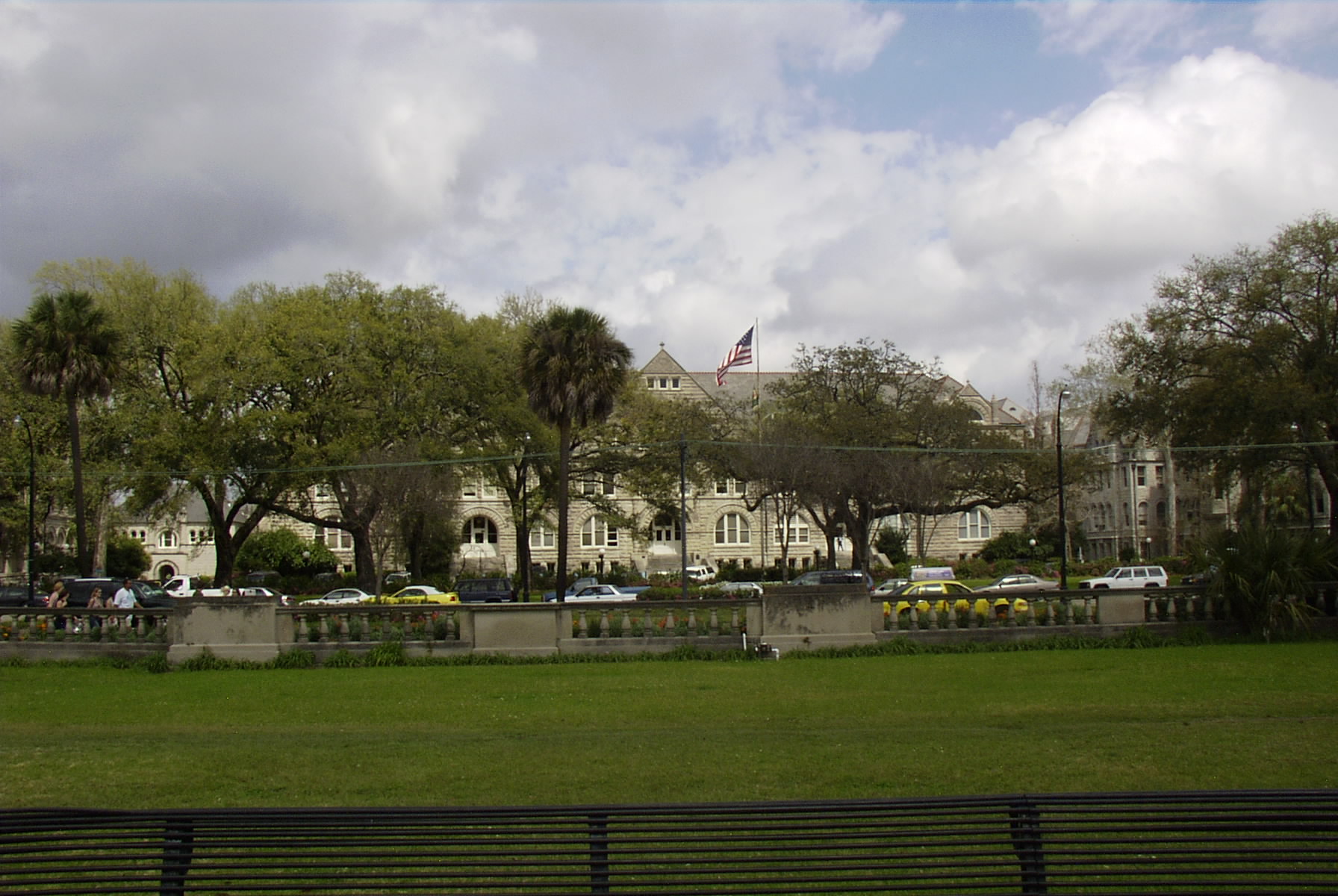
A third side of this came up just this week while I was writing this response.  It has been suggested that my Alma Matter, Tulane University, change its name as a part of these changes.  As you learn on any tour of the school, the University, which was originally the publicly funded Louisiana College of Medicine, became a private school and was renamed in honor of Paul Tulane after he made a sizeable endowment to the school in 1882.  What you don’t typically learn on any tour of the school is that Paul Tulane was also the largest donor to the Confederacy in New Orleans.  This raises some deep questions about the suitability of the name.

Should his funding of the confederacy be honored?  No, it should be condemned.  Should his endowing a school with enough funding to be self sufficient and become a seat of higher learning be honored?  Yes, it should be celebrated.  I feel like the answer to this comes down to intent.  The issue is clear cut for me on Confederate memorials because the intent of the memorial is to honor the leader of the confederacy, but its murkier on the name of Tulane University.   The intent of the school’s name is to honor the endowment by Paul Tulane, not his actions which helped prop up the confederacy.  Nevertheless, he did do that and there is an unavoidable link there.  Furthermore, his endowment was made after about 17 years after the end of the civil war, and might be seen as a way of making amends for his support of the Confederacy.  Then there are the logistical issues, if the school were to change names, how would that even work?  Would they need to send new diploma’s and transcripts to all alumni?  And how would that affect their overall brand?  Maybe the university should resurrect the Newcomb name and change from Tulane University to Newcomb University?

Personally, I think a name change is not warranted, since the name is meant to honor the endowment not Paul Tulane’s role in supporting the confederacy.  That said, I think the university needs to use this as a teachable moment and show that even those who do great deeds in service of the common good can also do great harm.  At the very least they should start making it common knowledge that University’s namesake was also a supporter of the Confederacy and a complicated man.

DC at the Speed of Traffic

Capitol Hill Street Scene

The majority of DC is a pedestrian city; it is meant to be viewed up close and slowly. The streets of row houses are hidden behind a protective screen of trees and gardens known affectionately as “The Parking” and can only be fully appreciated by a pedestrian wandering in this ribbon of green. Viewing these neighborhoods form a car is a difficult endeavor, first the greenery obstructs many of the facades and second unless you find a place to park, the buildings go by too rapidly (even at a leisurely 25 mph) to appreciate the finer details. The same goes for the grand vistas of the National Mall and the Federal City, while these are on a grander monumental scale, they are only really appreciated by pedestrians who can walk their lengths. Cars are able to drive down along the mall, but again the view across is screened by greenery and the few crossings do not provide a full appreciation of the structured view. Even the Modernist complexes of near South West are better appreciated on foot. Sure, you can see all of the buildings from the street, but only pedestrians can explore the rabbit warren of tunnels, paths and connections that link this Modernist Bloc into a city unto itself.

K Street

[Image via mgrass.]

There is a place in DC where this pedestrian preference disappears, and is in fact a hinderance, the golden triangle area of downtown. The buildings in this part of the city are not built with the pedestrian as the main consumer, sure there are pedestrian level storefronts and lobbies, but to be able to fully appreciate the streetscape you have to be driving. A perfect exmaple of this is K street. As a pedestrian the buildings on your side of the street seem to rise ever upward making canyons of steel and glass and the buildings across the way can only be seen at an almost worm’s eye perspective view perpendicular to the street or as an oblique two point perspective view down the street, either way the facades are not fully appreciated. Furthermore, the rhythm of the structures is such that a pedestrian it is boring, the bulk of the facades utilize very long elemental repeats which as a pedestrian are almost invisible.[There are a few exceptions to this, the buildings surrounding Farragut square tend to play to the park instead of the cars, and as such there are some stunning examples of intricate facades. But this is a a rarity] All of this changes from the perspective of the driver’s seat. The composition merges into a single point perspective view of the avenue where the bland facades suddenly reveal upper level details that were previously hidden. Furthermore, traffic not withstanding, the buildings read much more poetically at the stately speed of 25 miles per hour, their bland facades quickly passing and morphing into a steady stream of rhythm and order.

View across Faragut Square

How to survive an Ice Age

Chamonix - Inside Mer de Glace

[Image via richdedeyan.]

BLDGBLOG ran a story today about Project Iceworm and how the US had at one point built a research/military base UNDER the greenland glacier. While reading this story, all I could think of is how this kind of technology could be used. The three places my mind goes are colonizing Antarctica, surviving the next Ice Age, and colonizing Enceladus the Ice Moon of Saturn. I know, crazy right?

With modern advances in hydroponics and a near limitless supply of geothermal energy we could live quite comfortably inside an ice sheet. Of course a nuclear reactor or some other source of power would probably be needed at first to get the colony/city started, because it would take a while to get a hydrothermal system in place (and if this was an offworld colony the planet/moon would need to have an active geothermal system to support that kind of powerplant), but thats a startup cost that could easily be repaid overtime with ready access zero-emission renewable energy. Plus, during the “melt” season, you could harness some of the sub ice melt paths as hydro-electric systems. Sure, there would be the constant maintenance and trimming of the tunnel walls, but thats the source of the city’s drinking water. The biggest issue would be maintaining contact with the world outside of the frozen city.

Its just a thought, though I admit a slightly crazy one, but at least its not an undersea dome city. And hey, stranger things have been done – man made islands anyone?

Heaven in 3 and half rooms

Pope-Leighey House, Fairfax, Virginia.

In Fall of 2009 I went on a trip to Deep Creek Lake, Maryland with some friends. While I was out there I took the opportunity to visit both Falling Water and Kentuck Knob. They are about an hour away and part of the same tour system. While Falling Water may well be Frank Lloyd Wright’s most well known home, neither should be missed. Kentuck Knob is a great example of how a Usonian Home could be modified to suit the needs of a much wealthier client than the original target market. Furthermore, the house is built on a hexagon base unit which stands in full contrast to the rectangle used as the base for Falling Water.

Pope-Leighey House Bedroom, Fairfax, Virginia.

When I returend to Northern Virignia I had the pleasure of touring a third Wright home, the Pope-Leighey House, a more traditional Usonian Home. While less well known, this house holds its own in any architectural arena. Compared to Kentuck Knob and Falling Water, this middle class home feels more garden folly than full time residence, but it is a great example of an early compact Modern compact home which manages to fit in the creature comforts in the smallest of spaces.

Pope-Leighey House Living Room, Fairfax, Virginia.

Which leads me to the general feeling I had about all three residences: how small and cave-like they felt. All of the spaces are characterized by tight control of light, generally short ceiling, and a lack of extraneous space. All three houses function in a completely different domestic paradigm than today’s residential housing stock. Wright’s signature styles of compression and release and geometric efficiency of space stood in sharp contrast to the contemporary residential style of orthographic expansion and redundancy. This is all part of the drama of his architecture. Falling Water, which has a total of 5,330 square feet (2885 square foot interior; 2445 square foot terraces) and a guest house of 1,700 square feet, is comparable to many of the McMansions of recent years with their 3,500 Square feet of interior space; but yet they somehow feel larger and grander. Even the minuscule solar decathlon houses which are often criticized for being free standing one bedroom apartments feel palatial compared to Wright’s 1200 square foot two bedroom, 1 bath, with office Pope-Leighey House.

Falling Water Guest House and Walkway, Mill Run, Pennsylvania.

All of that said, there is a comfort to be found in these small quarters. Everything feels more appropriate and human scaled and so well designed that additional space would be an unwelcome excess. Furthermore, these houses, unlike our modern bog-box storage units, are designed with a bare modicum of storage locations. The house is on display, not your collectibles. That is not to say these houses are austere, far from it, nor are they filled with a Rococo style of ornament. They walk a fine line between monk’s cell and IKEA showroom.

Kentuck Knob Entry Forecourt, Chalk Hill, Pennsylvania.

Solar Decathlon

Today I headed down to the Solar Decathlon on the National Mall. While there I was able to tour 15 of the 20 homes. I was happy to see that the Mall was crowded with people braving the wet and cold to visit these houses, even if that meant that the lines for some of the more award winning homes (like Germany and California) were so long that I chose to see 8 other houses instead of trying to get into them.

These houses all had innovative design solutions to create energy efficient and responsible homes. Interestingly enough, most of the homes used off the rack products, but just assembled them in innovative ways. Where I found the homes to be lacking was that most of them did not fully address their sites. Many of the homes did not interact with the portions of their lots that faced away from the main walk-way (those on the North were predominantly South focused, and those on the south were mainly North focused). Now I know a lot of this had to do with strategic window placement, but for homes which were little more than 15’x50′ rectangles it felt like opportunities to fully engage the site were lost. The teams DID engage the sites, they created decks, plantings and water features, but the houses often did not interact with these features.

One of the things that I found the most informative about the whole competition was not something anyone did, but rather what they were prohibited form doing. Most of the teams had integrated some form of waste water reduction technology through the filtration and re-use of gray and rain water systems. Unfortunately, they were not allowed to use these systems, because in DC it is a violation of plumbing code to use rain or gray water from anything domestic; it can only be used for landscaping needs. Apparently this is standard in many jurisdictions throughout the country. For a city that is trying to be more LEED friendly and at the same time develop its urban neighborhoods, this is a travesty. The student representatives at many of the buildings made it a point to highlight the water savings features and their inability to use them and encouraged visitors to contact their representatives to change this piece of legislation.

I’ve been cheating on my own blog!

I’ve been harboring a secret for the past few weeks and been dying to post about it but had to wait until it went live. I am now a weekly feature writer for the DC architecture and property blogDC Metrocentric. Its one of the reasons O haven’t posted on here very much, that and just plain laziness. I’ve spent quite a bit of time trying to develop a writing identity for that site. I will be analyzing and criticizing local architecture within the beltway. If anyone has any suggestions I would welcome the input.

You can find my first post, a criticial analysis of the architecture of the Metro system, live on the site now. Feedback would be greatly appreciated.

Coraline – she’s the reason for the word semiotics.

Friday the 6th of February I took the opportunity to see the newest adaption of a Neil Gaiman story into a movie, Coraline. This movie, while shown in 3D and marketed towards children, is not a children’s movie. It is very dark and frankly, at times it can be scary, but that isn’t to say that the lessons of the movie are not lessons children should learn. The essence of the movie (plot and psychological concepts) not withstanding, I think this movie (and obviously the novel it was based on) can illustrate a lot about the role of architectural discourse and place in surreal post-modern fiction. Now, I won’t pretend to have references or anything as researched as that, but I wanted to share my take on the movie and how both concepts of the home and domesticity and the architecture of place are used to illustrate the lessons of the film.

Theatrical Poster for Coraline

[Image via IMP Awards.]

Friday the 6th of February I took the opportunity to see the newest adaption of a Neil Gaiman story into a movie, Coraline. This movie, while shown in 3D and marketed towards children, is not a children’s movie.  It is very dark and frankly, at times it can be scary, but that isn’t to say that the lessons of the movie are not lessons children should learn.  The essence of the movie (plot and psychological concepts) not withstanding, I think this movie (and obviously the novel it was based on) can illustrate a lot about the role of architectural discourse and place in surreal post-modern fiction. Now, I won’t pretend to have references or anything as researched as that, but I wanted to share my take on the movie and how both concepts of the home and domesticity and the architecture of place are used to illustrate the lessons of the film.

First, the use of visual iconography in relation to the overall appearance of the Pink Palace helps convey the mood of the story.  In the real world it is  weather-beaten  and badly in need of cosmetic repairs; the shutters are falling, the paint is peeling and the external attic stairs are precarious at best.  This gloom spreads to the garden as well, where the plants all appear dead.  At first, in the other world, it is a perfect victorian cottage.  The colors are bright and cheery, the shutters and trim are well maintained and delicate, and the stairway to the attic appears sturdy and stable.  In the other garden, the plants spring to life and are filled with a neon electricity at the presence of Coraline.  When the world starts to unravel all of these elements are turned around.  First the garden turns dark and vicious, then the external stairs come loose form the house, and lastly the colors start to fade from the entire world and with them the details of the house’s exterior.  The same  parallels  exist in the interiors as well, what was is really in need of some love and attention in the real world is at first shiny and perfect and then decays in the other world.  This treatment of the visual language of architectural elements help to portray Coraline’s opinions of both worlds: her world seems banal and lacking compared to the life she left, while the other world is exciting and fun, until its trap-like nature starts to become visible, which in effect helps further the movie’s message that nothing is perfect and to beware that which is too good to be true.  In the end, Coraline and all of the houses inhabitants appear to have taken the chore of its maintenance and care into their own hands.  Further showing that the world is what we make of it.

The second topic that I think bears exploration is the movie’s exploration of smooth and striated spaces.  In Coraline’s  traveling  through the hole in the wall she journeys through a smooth space – a space where there is no relative measure of comparative  movement.  This journey of considerable distance appears to put her exactly where she left, except this is another version.  The audience can interpret this either as she has not moved at all, and is in essence in a world within her house, or she has travelled a great distance to find herself in a  parallel  (albeit created) world.  This is held in comparison to when Coraline tries to run from the other mother to the well.  She is obviously moving through striated spaces – spaces where this is a means of relative comparison of movement, yet she  effectively  winds up exactly where she started.  She did not “run around the world” as the cat states, instead she has been effectively transported back to her origin,  but  facing the  other  direction.  This counterintuitive interpretation of striated spaces helps to emphasis the cat’s warning about the other world, that it is not what it seems.

A third architectural reading from this move can be taken from the treatment of the hearth.  In semiotics, the hearth is a symbol of not only warmth, but also of family, comfort, creation, and the concept of the home.  In the other world, the hearth is none of these things.  The hearth is located in the other mother’s room, and in essence is an element of  destruction  and separation from family.  The other mother imprison’s Coraline’s family in a snowglobe on her hearth, thus removing her from her family, she burns the gazing stone in the hearth removing a method of Coraline finding her way home.  In addition, the other mother’s hearth spreads an eerie glow across the room and generally  emanates  a feeling of discomfort.  This contrast is not ideal though.  In Coraline’s real world, the hearth is a relatively sterile item.  Family life does not revolve around it, and it does not play a large role in early parts of the movie.  Its main function here is housing the  accoutrements  of family, the snow globes and other  collectibles  that have accumulated throughout the years.  This is the closest the hearth comes to playing a traditional role in Coraline’s world.  Yet this is important to illustrate that her world is not perfect, but it is still her; world.

One of the last things that I find intriguing from a space planning point of view is the little door in the wall.  Coraline’s mother suggests that it may have once linked to one of the other apartments in the Pink Palace.  This is an odd statement.  From the way space is shown in this movie, the house is divided into three apartments: the Basement, the main floor and upstairs, and the attic.  If this door ever connected to any other space it would have had to be a means of  vertical  connection, a la a dumb waiter.  Yet those are mounted mid wall at grasping height, not along the floor.  In addition, the rest of the house (save the hearth) appears to be a standard wood American Victorian house, if that was the case, what would be the  explanation  for brick to be present behind the wall.  If this was a flat in England than the presence of brick would be more plausible.  All told, this seems to be an architectural way of making the audience (or  at least those that are architecturally inclined) aware that something is not quite right with this door.

Bearing all of these things in mind, I would love to watch this movie again and look for further means in which spatial coding and architecture are used to tell the story and influence the audience.

Preservation, not just for berries anymore!

Preservation Matters: a symposium at Tulane School of Architecture

[Image via Tulane School of Architecture .]

Tulane School of Architecture is hosting a one day symposium at the end of January focusing on Historic Preservation. The keynote speaker will be Robert Ivy, FAIA and one of my favorite professors, Eugene Cizek, FAIA, will be providing commentary. This symposium is free and open to the public. If I was able to be in New Orleans, I would love to attend.

In light of the natural and governmental disasters in the past few years and the public policy debates currently raging within New Orleans, this symposium seems slightly overdue. I am glad to see that the new Dean of the Architecture School, Kenneth Schwartz, FAIA, is doing something that should have been done years ago. The historic preservation program is one of the few distinguishing elements of the Tulane School of Architecture, it helps ground architectural education at TSA to “the place” as well as “the time.” In the time I was at school, it felt as if the program did not get as much attention and funding as some of the more esoteric modernist pursuits. At times we felt like the red-headed step children of the school.

I may not personally agree with all the philosophical and ideological teachings I was taught during my historic preservation classes, but i do credit this program for helping me make the shift from design student to practicing professional. It was the only area of my education where material interactions with environmental factors as a function of building life were ever considered critical, or even discussed; it is also the only time we were able to, never mind required to, design an adaptive reuse project. This program helped introduce students to public planning officials and organizations and better inform our understanding of the political and legal process of building and protecting structures. It also broke the design bubble fostered in many of the other studios by merging design students with masters of preservation students (MPS) who were rarely design professionals.

Steel skin can hide volumes about an architect’s structure

The entry to the Disney Concert Hall by Frank Gehry

Frank O. Gehry, there is no other practicing architect who has as much name recognition amongst laymen and who can cause such distress amongst architects. With his two recent projects (the Princeton Lewis Science Library and an addition to the Art Gallery of Ontario) open to the public there has been much talk about the stylistic dichotomy between them. Phillip Kennicott, in an article examining Gehry’s body of work, wrote in this past Sunday’s Washington Post:

as observers attempt to sum up his career and project his legacy, there is a growing sense that his most acclaimed work, buildings made in the style of Bilbao, have turned out to be dead ends. Rather than open up new possibilities for the architect, they seem to have left him in a rut. And as his most recent projects suggest, Gehry’s best work today may be his least “Gehryesque.”

Yet, I have to wonder if the critique’s that have been written about these two buildings and their relationship to his work as a whole have missed the forest through the trees.

The problem with analyzing Gehry’s work is that too often critics fall into the trap of comparing his buildings as individual works against the sum total of his previous work. The problem with this is two fold: first, many of his buildings are being built out of order, i.e. they were designed long before the financing, permits, and land deals came through; second too often critics are distracted by the finishes and forms of his buildings an do not look at the concept behind the skin. These issues can be mitigated if the some total of his work to date was explored not as a collective of past explorations, but rather as one large art exhibition with a common theme.

At first this idea must seem outlandish; what relationship can there be between the offices for Chiat-Day, the Gehry House, Bilbao, the Lewis Library and the Art Gallery of Ontario? The answer is volumes and skins. In everyone of these buildings (and dare i postulate, all of his buildings) Gehry has been experimenting with ways to create and mask volumes through the application or removal of a skin. The Chiat-Day office building is an exploration of volume, two large mostly rectangular prisms are separated and obscured through a binocular shaped volume (an ode to Po-Mo if there ever was one). The skin of this building was classical in nature and snug to the volumes, but still a skin; it was allowed to create non habitable spaces in an attempt to both create sculptural forms and indicate its non-structural nature; it is punctuated by punched openings which allowed views into and out from the interior volumes.

Where Chiat-Day is about volume, the Gehry house is all about skin. The house is a pretty standard house volume, but the skin has been removed in places and reconfigured in others. The drywall has been removed form the stud walls to create views of the wall structure, and a chain link fence which normally serves as a landscape skin of sorts is repurposed to skin the roof terraces.

Bilbao (and the Disney Concert hall) take this skin and volume dynamic to the next stage. The volume is wrapped in and obscured by an opaque artificial metal skin, which has been peeled back and removed in some areas to provide light and occupant access into the spaces. In the case of the Disney Concert Hall, the skin has been held back from the building in some areas to provide views of the structure, much like the Gehry house, but instead of revealing residential construction, here the armature of the metal skin and the steel support columns of the interior volumes are revealed.

In the Lewis Library (and in many cases the Stata Center) there is both an artificial skin present which is held off of the volumes as well as a very classical skin which is allowed to fit snug to the volumes. But here, the volumes are neither rectilinear Cartesian Spaces like Chiat Day nor programmatic blobs like Disney and Bilbao, instead they are deconstructed trapezoidal prisms which are not informed by the shape of the program they contain . In this way the volume skin dynamic is becoming a Russian nesting doll. The skin wraps the volume (and in some areas is broken by the volume) which in turn wraps the program elements but all are done in such a way as to reveal that the moves are deliberate and non derivative from function, i.e. these building are the antithesis of the Modernist creed – form only casually follows function.

Lastly, in the Art Gallery of Ontario, we see a more restrained skin being applied to a volume – here it is a glass wall instead of an aluminum panel. In this exploration, Gehry has taken the opportunity to create a skin which reveals the volume and structure inside through its very nature. No longer does the skin act as a barrier to the public eye, creating structured views and concepts of the building, instead it is additive to the building, opening the space and structure up for observation.

Phillip Kennicott states that he believes that “[w]hat Frank Gehry needs now is a new chapter, a last act, a purifying of his life’s work into something final and thoughtful.” I have to disagree; when viewed as i have demonstrated Gehry’s work is already thoughtful and quite pure. While it may not be the kind of legacy that stays alive with Joe Public, I feel architectural academics already have plenty to discuss. I have no doubt that future work of his will further explore ways in which volumes can interact with artificial skins, and in doing so inform the occupant and observer about the structural nature of the building. While not the culmination of his work, when viewed as part of a logical and deliberate exploration of volumes and skin you can see how this building is very “Gehryesque.”

Architect as artist

In the past century we have seen the rise of polytechnic architecture, a method of building which divorces the architect from the world of art and creativity, and instead treats buildings as solutions to engineering problems and casts architects in the role of project managers, facade coordinators and space planners.  Working and living within this modern paradigm it can be easy to forget that our profession is not just about ensuring the health, safety and welfare as our licenses require, but also about creating spaces that inspire and capture the imagination.

The New York Times has an interesting article describing a new exhibit of sketches by Frank Gehry at the Princeton University Art Museum which help to remind us that architecture is more than creating big boxes for commercial and residential means. While I am not a huge fan of Gehry, and feel that he is more popular for the “cool” factor of his buildings than for the real reason he should be popular – that if you consider the sum total of his works as one examination in form, it is a very interesting exercise in mass and volume and the delamination of these masses and volumes, I am glad that someone has started a discourse about the art form that architecture once was, and could still be. The real issue here is not that too few architects sketch, but rather too few architects are given the freedom to explore and create works of art. Instead they are directed to design to meet a specific style (and sometimes meet public approval) and then produce a building within (or under) budget while creating drawings that assume that the construction team will have no knowledge of how to build a building so as to limit their legal exposure. This creates buildings that have a watered down aesthetic and take few risks.