Kube Open House

Street View of KUBE House in Georgetown

I went to an open house a number of months ago for a new project by KUBE architecture. From the street, this Georgetown home, designed by Janet Bloomberg, seems to be yet another Georgian town house. When you open the door you find yourself transported to a modern space more at home in Los Angeles or manhattan than the 18th century streets of DC’s 2nd ward, yet the starck transition works. It sets you up for a series of well lit rooms that play with the modern trope of compression and release but manage to avoid the pitfall of hyper-glossy surfaces that are too often found in contemporary spaces. Instead Janet has chosen a muted palet of textural elements which alternate between the sheen of brushed metal, the warmth of rich wood veneers and the pleasantly imperfect nature of unglazed ceramics.

Front Window Bay of KUBE House in Georgetown

The house is anchored by a floating stair whose verticality is emphasized by a curtain of steel cables running from the ground floor to the second story.  While an interesting architectural element, the steel cables at times present a bit of a challenge in visual and physical comfort.  When I visited the house was very crowded, the steel cables made the narrow kitchen passage feel even tighter.   While a wall would have made the situation even worse, an open void may have made this space not nearly as tight.  Then again, in a day to day mode, this would never be an issue.

Kitchen and Stair of KUBE House in Georgetown

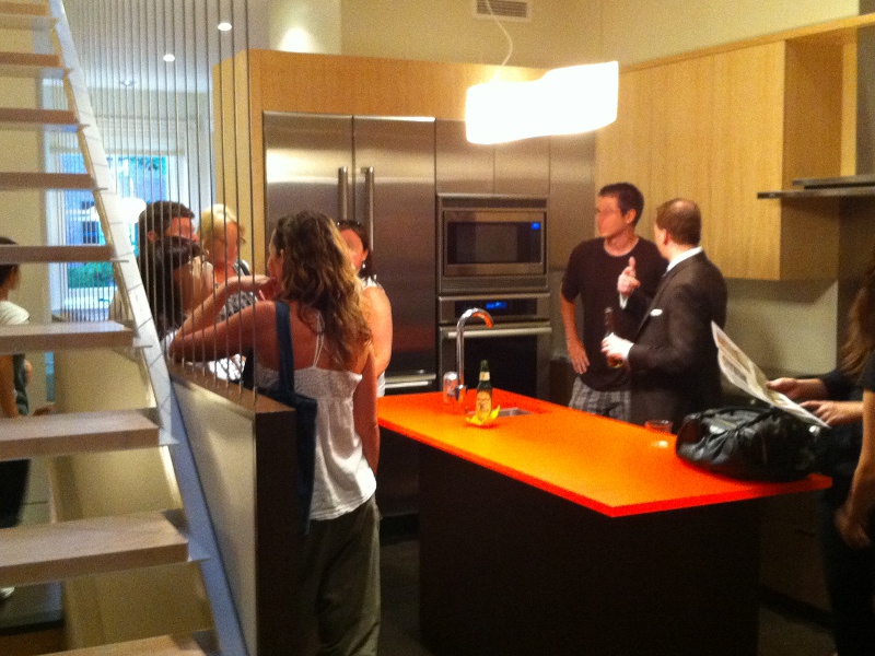
Light plays a big part of this house, Light is brought in through a skylight in the center of the house. Part of it is captured in the bathrooms through the use of a glass baseboard along the bathroom walls to allow subtle lighting in while still maintaining privacy. It should be noted that privacy is also an essential element for the master bathroom whose door is hidden in plain sight amongst the wall panels of the Master Bedroom. Light then filters through the stair cables and into the kitchen and is supplemented by a slim window along the south kitchen wall. The kitchen itself was an interesting mix of two wood tones, stainless steel counter-tops with an integral sink and a bright orange frosted a transparent polymer island top. Finally light filters through a glass panel under the stairs into the large finished basement with a bathroom. This space is nicely lit and could easily be adapted as an extra bedroom or as a guest suite.

Rear Operable Wall of KUBE House in Georgetown

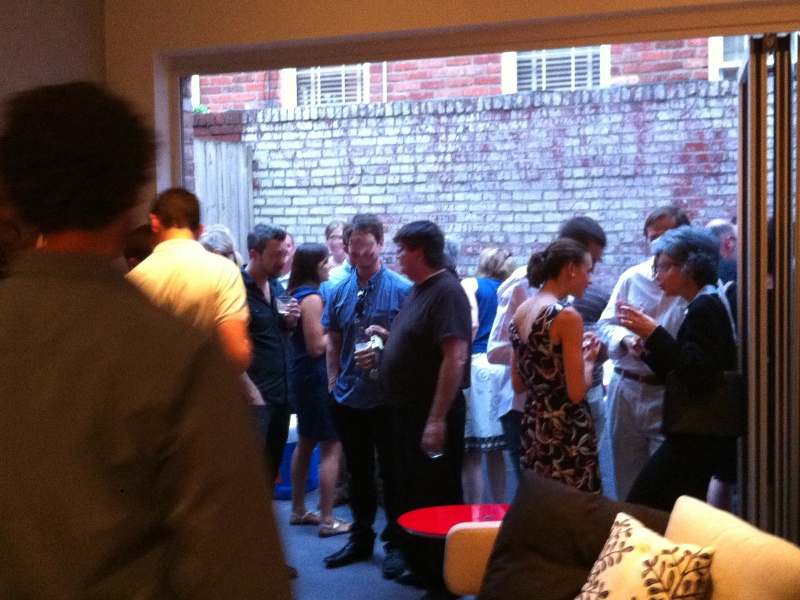
The rear wall was a NanaWall like system; when opened it complete disappeared allowing the small rear yard to flow into the house as one living space. Combine this with the mostly concrete back yard and you have a space that easily could be an extension of the living room. The cast concrete backyard has a poetic 3 square feet of grass, which is just large enough to be noticeable, but small enough to be ironic. If there is anywhere where I felt things could be improved it would have to be the rear yard; while I get the statement that is being presented here, I would have loved to see a tree or two worked into the backyard, it felt like a missed opportunity.

Adaptively reused Circuit Cities, here we come!

With the recent closing of many of the area’s Circuit City stores and the bleak financial forecast, this Sunday’s Washington Post article about what to do with big box stores after they close down, seemed to be fortuitously timed to impact the local planning discourse. For this article, the Post assembled a collection of local architects and artists, such as Darrel Rippeteau, Roger K. Lewis, Esocoff & Associates, et al., and asked them how they would reuse a big-box store.

The graphics in this article are intriguing and open an sub/urban planning discussion on what to do with the trappings of early twenty-first century American development once this business model has changed. The proposals include luxury housing, gardens, vineyards, and other adaptive reuse measures. This is all green and good, but I have to question the safety and cost of reusing these big box stores. Like fast food franchises, big box stores are not built to last. They are not constructed with any concept of their permanence, instead they are meant to go up quick and cheap and come down the same way when the new mega-ultra-super mart opens around the corner. The advantage of reusing old warehouses and factories is that theses large masonry structures were built to last and much of these structure can be re-purposed for less a strenuous program. This advantage would not be present in the Circuit Cities which will soon find themselves lacking a purpose.

There was one proposal that stood out to me, instead of re-imagining the big box store, it adapted the parking lot to a more urban context. The design called for two “linear buildings” surround a “parking module.” This strategy is closely related to one of the common forms for multifamily construction – the Texas Donut. In this strategy the parking garage is surrounded by the program, hiding it from view and creating a “safe” place for parking. This is a strategy that has become quite common in urban fringe development and could be beneficial in creating density within the big box context. The other reason this strategy caught my eye is that in my Thesis project for architecture school, I repurposed the parking lot of a Wal-Mart in New Orleans to create a public plaza and a municipal library. Part of the goal of my project was to acknowledge the big box stores as the modern equivalent of the urban market and to reintegrate them into the civic context.

From Highboy to Turbine

bookcase stair

[Image via Inhabitat.]

So it looks like Dubai is approaching its Po-Mo phase, Philip Johnson beware!

In an almost deferential move, there is a new building slated for construction that looks like a Turbine (see this post at Inhabitat). Instead of going the Masdar route and building a building that generates its power, this building just refers to the shape of turbines as a way of co-opting the green building trend and making it a design statement. In place of power generation, the “turbine” will generate spectacular views of the desert mirage that is Dubai for the dinners in its floating restaurant.
It is interesting to note that the design firm that built this project Atkins Design is responsible for many other projects in Dubai and the arab world including the Burj Al Alrab and the Jumeirah Beach Hotel. One of their projects which I have wrote about in the past is the Bahrain World Trade Center, which has three actual turbines that generate power for the building.

Philip Johnson's AT&T Building

[Image © rieteree all rights reserved.]

The reason I bring up Po-Mo and Johnson is that this project in Dubai seems such a blatant progeny of his AT&T building (now Sony building) in NYC. This building was meant to evoke the prestige and Americana patriotism of a Chippendale Highboy in the treatment of its roof line. Much like the Vana Venturi house brought post modernism to the home and hearth, Johnson’s AT&T building brought the language of Post Modernism to commercial construction. No longer were smooth glass boxes a la mode, instead references to historic forms were used to tie companies to abstract ideas and emotions.

It will be interesting to see if this new tower in Dubai will change the architectural discourse further. Instead of just buildings referring natural elements such as flames and water droplets (Champana’s Dubai Towers and The Shanghai Cruise Ship Terminal) this new building takes it a step further and refers to power that these natural elements can generate without actually generating it. This contradiction seems to say “Hey look at me, I’m cool, I’m a green product, but not really – I’m so hip I don’t need to be green.” Taking this to its natural conclusion, might we start seeing buildings decked out with “faux-to-voltaic” panels and AstroTurf green roofs? If Dubai is the new New York and considered a barometer of the commercial architectural zeitgeist, we just might.

Critial Olympianism

SCOTT BURNHAM has a realy good post about the Beijing Stadium. He contends that the now ubiquitous “Bird’s Nest” shows a striking similarities to the improvised safety screening that Chinese migrant workers erect in buildings. This woven mesh of slates IS eerily similar to the form of the outer skin on Herzog & de Meuron’s Stadium.

Stadium vs Improvised Safety Barriers

[Image via SCOTT BURNHAM.]

SCOTT BURNHAM has a realy good post about the Beijing Stadium. He contends that the now ubiquitous “Bird’s Nest” shows a striking similarities to the improvised safety screening that Chinese migrant workers erect in buildings. This woven mesh of slates IS eerily similar to the form of the outer skin on Herzog & de Meuron’s Stadium.

Personally I find this to be a wonderful thing, with just one caveat. This is a great example of critical regionalism. An architect is taking a native form and filtering contemporary design through it. The mesh could easily have been some less derivative form, but through the interpretation of the wooden slats it becomes essentially Chinese. The big warning I have here is that this is critical regionalism because the artistic direction for the Stadium comes from someone who is OF this culture, unlike the architects who are outsiders.

Articles of Interest

Here are some links to articles that have peaked my interest in the last few days:

Eastern Bloc meet Eastern BLOCK

The Times Online has an interesting article on the new CCTV building in Beijing. I’m sure everyone has seen this new iconic building by now, it rises like a wracked square casting an imposing shadow over the city below.

It is no surprise to me that the co-architect of OMA’s CCTV building, Ole Scheeren, is an impossibly young (35 years old) German Architect who was lived through the unification of Communist and Capitalist Germany. In the shape of the building it is easy to see the fingerprints of earlier experiments in modernism, in both the stark oppressive communist variety and the lofty grasping skyscrapers of New York and Chicago. And yet it has been distorted and made more complex. It is almost as if someone took the Arche de La Defense and twisted it until not only did the building distort, but the skin was also skewed.

This building challenges not only the symbol of a skyscraper but also that of the communist party controlled media in China. It could be a building in the process of collapse, a colossus falling to the ground, or it could be seen as a tower pulling itself up from the ground. Just as it could be a symbol of oppressive all-seeing orwellian control, or possibly a watchdog sheltering the people of china and enshrining their future. Only time will tell.

Bang Zoom, To the Moon Greg Lynn

Image via lifewithoutbuildings via io9

[Image via Life Without Buildings via io9.]

In his blog Life Without Buildings, my fellow Tulane Alum, Jimmy Stamp, discusses the latest proposed moon habitat from NASA. Like most of the other articles I’ve seen he discusses the igloo-like shape and inflatable (gas-itechture) structure, yet this discourse is really lacking.

What we are seeing here is not just another exploratory vehicle that will double as a place for astronauts to sleep. Consider Voyager for a second Ann Druyan recorded all sorts of sounds emblematic of the human race, to act as a time capsule, a display of who we are; this is the first piece of human architecture to be built on another celestial body, and I have to ask, where’s the outrage? Of all the structures in all of human history, this is what we build, an inflatable breast? It looks like something Greg Lynn would create, but instead it was designed by engineers? In addition, since when do we allow engineers to create the first lunar human dwelling? Where is the discussion of the space it makes, the space within and the views out? Are there views out? How does it interact with its environment? All of these questions are not a part of the discourse, but they should be. If this was going to be built on earth, in Antartica or below the ocean, these questions would be asked, and maybe those questions are coming. But the discourse should go beyond the poetics of space in space, how is this station powered? Are they using solar arrays, or can they use solar glazing and create views and power at the same time? Is this going to receive oxygen from earth in canisters or farm it through phytoplankton and algae? I guess I’m just an all or nothing kinda guy, don’t tempt me with these images and not give me a full photo tour and write up of the entire moon base.

Home is where the LEED is

A bird's eye rendering of one of the 100k houses

[Image via Inhabitat via 100khouse]

So Inhabitat has an article which starts off like a bad joke; an architect, a developer and a builder decide to build a LEED certified home for$100,000. And that is it, there is no punchline, because its not a joke. They are building two 1000 square foot homes for $100 a square foot; they have been working at it for over a year now and just sold their first of two homes. You can read their blog and web page at 100khouse.

There are three things that intrigue me about all of this. First is that we bought our 13 year old 950 square foot condo in suburban Northern Virginia last year for $235,000 and these home are going to be/being sold for $200,000-250,000. It really highlightes the difference in cost of living and commodity. I live in a previously lived in stock developer’s condo for the same price as someone else could be living in a brand new well designed environmentally friendly single family house, and the architect/developer/contractor will all still be making a profit off of it. That just blows my mind. The second is the lack of exposure or lack fo existence of projects like this near around the country. Why are there not more affordable infill LEED housing? Why are we building more pop-up carbon footprint heavy custom builder townhomes when we could be developing LEED accredited suburban pre-manufactured well designed individual developments? And lastly, why am I not involved in a project like this? How does one go about getting ahead of the curve? Is this something that you have to wait until your licensed for, or is it something that you can make happen by being deliberate in your career path? Once you start down the road of traditional internship and licensure, is there a turnoff where you can switch into cutting edge design and urban planning? Is it possible to be something greater than an fabric building designer/builder possible without having independant wealth and patronage?

In an unrelated but yet pertinent development, I have the possibility to help a friend out with their damaged home. They suffered sever roof and exterior wall damage as well as water damage and depending on what they decide to do, they may need to do a thorough renovation. I would love to finally have the chance to think critically again and solve their design problems, to break away from institutional work for a little while and explore smaller more human forms and scales. On the other hand, if they don’t decide to go with me, the whole process has been a learning experience, one that gives me some light at the end of the tunnel and helps me to see some answers to the questions I posed above. Specifically – yes it is possible, it is all possible, it just takes time, friends and the right series of unfortunate events.

SaveSave

Article: Gehry goes Geometric!

The exterior of the lewis library

[Image via Princeton University]

Frank O. Gehry‘s new building at Princeton University – the Lewis Library – is nearing completion. Princeton’s website has an article describing the new building and giving us a sneak peak inside.

The exterior of the lewis library

[Image via Princeton University]

I hate to prejudge this building, but from the pictures, I worry that this is going to be even worse of an occupant experience than MIT’s Stata Center. The bright contrasting colors of the interior and the sharp dramatic angles seem to go one step beyond the Stata, which looked like it was falling down, instead, the exterior of the Lewis Library looks like a jumble of child’s block swept under a rug and the inside looks like something from a medieval view of hell. In addition, from what we can see in the photographs and what has been installed already, there seems to be a lot of hard surfaces with little acoustic dampening (a problem at the Stata as well). The article makes the claim that the third and fourth floors of the building’s tower will be the quietest places on campus, but i have to wonder about the rest of the building. As far as the exterior goes, it seems to be a natural progression in Gehry’s work. The obvious influences are the Stata center and the disney concert hall as well, but there are more subtle influences here as well. I can see shades of Chiat Day in the volumetric massing and even some of his Gehry house in Santa Monica in the delaminating of the skin from the building and subverting of building conventions.

The thing that I find the most compelling is that when taken as a series this building, Bilbao, the Stata Center, and the Disney Concert hall you can see the progression of how GehryPartners designs – they create volumes and then wrap them in a skin. Bilbao and Disney are both skin-type buildings, Stata is a volume building. The Lewis Library is the closest thing to a hybrid showing both volumes of program and a steel wrapped skin. In two years, after this building has been open and inhabited for a while and has had its due in the architectural magazines we will see what the verdict is n this building.