Corbu, who?

Tomorrow is Black Friday, which means that the Holidays are right around the corner and with them comes the chore of finding the perfect gifts for those you are about. If you are searching for that modernist (or anti-modernist) in your life, you might think that the new biography of Le Corbusier by Nicholas Fox Weber would be the perfect gift. Hold back though, if Phillip Kennicott’s review in this past Sunday’s Washington Post Book Revue section, has any bearing, this new biography of one of the most famous and central figures in the modernist movement, Le Corbusier, might not be for you.

Of course, in this biography the author, Nicholas Fox Weber, spends much of the book focusing on the swiss architect’s poor behavior and fundamental dichotomies between his architectural vision and personal opinions. Kennicott’s review skewers the author complaining that the book is poorly written and almost unedited. In addition, it is his belief that while there deserves to be more written about Le Corbusier, this book focuses too much on the man and his accomplishments, and not enough on the resistance to his revolutionary ideas.

Adaptively reused Circuit Cities, here we come!

With the recent closing of many of the area’s Circuit City stores and the bleak financial forecast, this Sunday’s Washington Post article about what to do with big box stores after they close down, seemed to be fortuitously timed to impact the local planning discourse. For this article, the Post assembled a collection of local architects and artists, such as Darrel Rippeteau, Roger K. Lewis, Esocoff & Associates, et al., and asked them how they would reuse a big-box store.

The graphics in this article are intriguing and open an sub/urban planning discussion on what to do with the trappings of early twenty-first century American development once this business model has changed. The proposals include luxury housing, gardens, vineyards, and other adaptive reuse measures. This is all green and good, but I have to question the safety and cost of reusing these big box stores. Like fast food franchises, big box stores are not built to last. They are not constructed with any concept of their permanence, instead they are meant to go up quick and cheap and come down the same way when the new mega-ultra-super mart opens around the corner. The advantage of reusing old warehouses and factories is that theses large masonry structures were built to last and much of these structure can be re-purposed for less a strenuous program. This advantage would not be present in the Circuit Cities which will soon find themselves lacking a purpose.

There was one proposal that stood out to me, instead of re-imagining the big box store, it adapted the parking lot to a more urban context. The design called for two “linear buildings” surround a “parking module.” This strategy is closely related to one of the common forms for multifamily construction – the Texas Donut. In this strategy the parking garage is surrounded by the program, hiding it from view and creating a “safe” place for parking. This is a strategy that has become quite common in urban fringe development and could be beneficial in creating density within the big box context. The other reason this strategy caught my eye is that in my Thesis project for architecture school, I repurposed the parking lot of a Wal-Mart in New Orleans to create a public plaza and a municipal library. Part of the goal of my project was to acknowledge the big box stores as the modern equivalent of the urban market and to reintegrate them into the civic context.

From Highboy to Turbine

bookcase stair

[Image via Inhabitat.]

So it looks like Dubai is approaching its Po-Mo phase, Philip Johnson beware!

In an almost deferential move, there is a new building slated for construction that looks like a Turbine (see this post at Inhabitat). Instead of going the Masdar route and building a building that generates its power, this building just refers to the shape of turbines as a way of co-opting the green building trend and making it a design statement. In place of power generation, the “turbine” will generate spectacular views of the desert mirage that is Dubai for the dinners in its floating restaurant.
It is interesting to note that the design firm that built this project Atkins Design is responsible for many other projects in Dubai and the arab world including the Burj Al Alrab and the Jumeirah Beach Hotel. One of their projects which I have wrote about in the past is the Bahrain World Trade Center, which has three actual turbines that generate power for the building.

Philip Johnson's AT&T Building

[Image © rieteree all rights reserved.]

The reason I bring up Po-Mo and Johnson is that this project in Dubai seems such a blatant progeny of his AT&T building (now Sony building) in NYC. This building was meant to evoke the prestige and Americana patriotism of a Chippendale Highboy in the treatment of its roof line. Much like the Vana Venturi house brought post modernism to the home and hearth, Johnson’s AT&T building brought the language of Post Modernism to commercial construction. No longer were smooth glass boxes a la mode, instead references to historic forms were used to tie companies to abstract ideas and emotions.

It will be interesting to see if this new tower in Dubai will change the architectural discourse further. Instead of just buildings referring natural elements such as flames and water droplets (Champana’s Dubai Towers and The Shanghai Cruise Ship Terminal) this new building takes it a step further and refers to power that these natural elements can generate without actually generating it. This contradiction seems to say “Hey look at me, I’m cool, I’m a green product, but not really – I’m so hip I don’t need to be green.” Taking this to its natural conclusion, might we start seeing buildings decked out with “faux-to-voltaic” panels and AstroTurf green roofs? If Dubai is the new New York and considered a barometer of the commercial architectural zeitgeist, we just might.

2008 – Top 24 Architecture Design Firms in the Washington DC area

Since moving to the DC area it has been easy to feel lost in the neoclassical and federalist architecture that pervades the area. Many of the firms here still work within those vernaculars. Those who differ seem to err on the side of bland post modern boxes. I decided that there had to be firms in the area who had a more avant-garde/metropolitan sense in their design aesthetic and so I searched through the websites of over 400 firms listed in the Washington, DC / Northern Virginia (NOVA) / Maryland region.

I only looked at architecture firms whose only office is in the DC metro area, and selected those that I felt had a more contemporary/avant-garde design sensibility. I feel that I have achieved my goal of proving that there are small to medium firms in the DC metroplex that focus on creating buildings/spaces that further the architectural dialogue and do not just rehash old building styles for the sake of building.

The following firms are in no particular order.

amestudio
Geier Brown Renfrow Architects
Robert M Gurnery, FAIA

a

David Jameson Architect, Inc
Randall Mars Architects
Fox Architects
French Studios
Suzane Reatig Architecture
envision
Schick Goldstein Architects
Bonstra Haresign Architects
Forma Design
Sorg and Associates
Christian Zapatka Architect LLC
CORE
Grupo 7
Cunningham Quill
Adamstein & Demetriou Architects
McInturff Architects
Division1 Architects
Shinberg.Levinas
WAHL Architects, LLC
S27 Architecture
KUBE Architecture PC

While, in my opinion, the firms below are not in the same caliber of design as the previous list, they are worthy of Honorable Mention.

I welcome your opinions, please register and create a user name to leave your comments.

If you liked this article, please digg it.

Lord, all firms can’t be corporate!

The DC area is filled with architecture firms, but I have been hard pressed to find many that are real players in the current avant-garde architecture climate. Most of the big name firms that have local offices focus on government work and not theoretical/concept work.

To wit, I am compiling a list of the best firms in the DC metroplex for publication as a future post to hopefully dispel the belief that good design cannot be found in DC.

Does anyone have any suggestions of architecture firms that go beyond the norm? I am specifically looking at firms that have an exemplary design identity.

The Laundry Room – a space for the new depression?

One of the things that has stuck me recently is the lack of a good space to do laundry in my current condo. Now, I have a stacked washer/dryer unit hidden in my front closet, but I really don’t have a good place to set up shop to fold clothes and iron. If I want to be near the laundry machines I can stand in my front hall and face a wall. But I tend to like distraction while I work, even considering that I truly do like to iron, so my living room is my chosen place of work. There is something very zen and calming about the repetitive motion coupled with the warmth and moisture, even with House blaring in the background. Now the problem with ironing in my living room/den/dining area is that like most 900 square foot condos, there is just not enough floor space to set up a board, have a place to hang finished clothes, a place for the wrinkled clothes, and have the standard coffee table and chairs or a couch. I guess I can look to building a board and hanging bar into some wall or part of an entertainment unit, and if i stay where i am, that is what will probably happen. I have to wonder though, thinking back to all of the apartments I’ve lived in, there has not really been any good place to iron clothes. I think the last place that has a decent laundry set-up was my parents house.

In today’s economic climate one of the first things that has fallen out of my budget has been dry cleaning/laundering my work clothes. I’m sure there are other young professionals who are in the same situation; we have living spaces where laundry facilities have become an after thought. They are adequate enough to wash your weekend and evening wear, but the layout is just not conducive to washing and pressing your work clothes: these living spaces were built with the dry cleaner in mind. With lesser expenses shifting from the necessity to luxury column, like daily coffee and meals out, I have to wonder whether more young people will start doing their own laundry. If so, it would be interesting to see if laundry zones become larger and more centralized in multi-family development units.

It wasn’t that long ago that “luxury” apartment buildings did not have in unit laundry facilities, just a few decades really. In that time, with advances in appliances and cooking technology, we’ve seen kitchens grow from an efficient galley to a showpiece selling feature. I have to wonder if in a decade realtors will be hawking the spacious and airy laundry facilities of the new luxury living and architects planning these new units around both the hearth and the board?

An Urban Plan for a New New Orleans

I submitted the op-ed below to the editorial desk of the New Orleans Times Picayune two weeks ago. I have not received any response to my inquiries, so I assume that they are not interested; if that changes I may have to remove this post. In any case, I would like to present my solution for a sustainable redevelopment of New Orleans:

An urban plan for a new New Orleans.

Although New Orleans avoided Gustav’s wrath, we need to learn as much as we did the hard way from Katrina. Instead of rebuilding the city and the levees as they were, we need to make it so that New Orleans will never worry about a hurricane again.

New Orleans has had a past fraught with disasters: twice fires wiped out the bulk of the French and Spanish colonial city and there have been numerous floods and levee breaks which have altered the city’s shape.  Over the last century we believed that we had bent nature to our will by controlling the course of the Mississippi River and preventing the annual flood. At the same time developers drained the surrounding swamps to make new low-lying easily flooded subdivisions.  The damage caused by Katrina showed this control to be fleeting.

The rebuilding after Katrina was done with the wrong methodology: we treated the symptoms, not the problems. What we needed to do was create a plan to address the environment, the economy and the unique identity of New Orleans, and we still can.  The levee system by itself is not sufficient; overtopping and crevasses are always a possibility.  The city needs a two tiered approach to safety, one which selectively prevents and allows controlled flooding in to create a city that can function with six feet of water in the streets of evangeline.  New Orleans is also facing a similar struggle with its economy; it relies on the tourism industry and the port to survive.  With the current downturn in the national economy there is less money to be spent which will eventually hinder both the shipment of goods and services and the attraction of money to the tourist trade.  The city needs a new sustainable identity.

To save the Crescent City we need to recreate it as a new Creole city by blending the local culture with building concepts from around the world.  The Dutch city of Amsterdam and an area of Peru called Belén both have novel strategies to handle flooding; one is a city that walls off the water and the other is a community that floats atop it.  The older urban areas of New Orleans should learn from Amsterdam and create more raised levees and canals to bring high water from the river and the lake to designated overflows, much like the Bonnet Carré Spillway.  These areas, the former swamps and low lying neighborhoods devastated by Katrina, could be built anew using updated concepts based on the Peruvian strategy; buildings and public plazas that lay on the ground during parts of the year, but float on the surface of the water during flood periods.  These buildings would be anchored in place but allowed to move vertically to adjust to rising and falling water levels.  This strategy could serve as a water recharge basin and allow all rain water to be pumped from the low lying city streets into the new controlled flood plains where it can be treated and released down river or into the lake.  This constant movement of water will work like a bayou and prevent mosquito borne diseases.  These levees and canals will create a more efficient mass transit systems with in the city with boat traffic running atop the water and an enclosed rail system below.

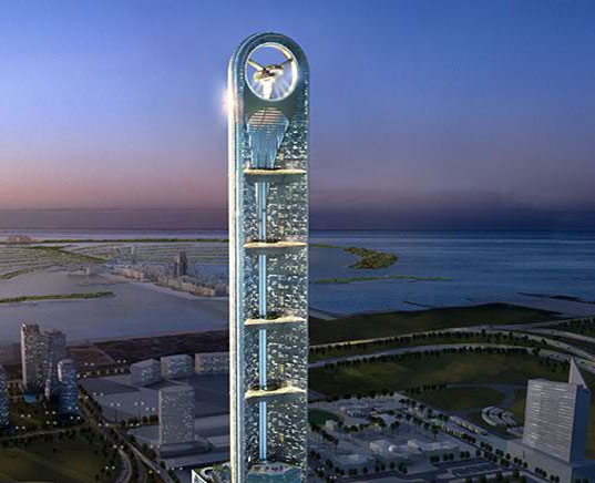
New Orleans should look beyond structures and embrace a new urban identity.  By improving upon the model of Greensburg, Kansas – creating all platinum LEED buildings and aiming for carbon neutrality – New Orleans could brand itself as the heart of the Green movement.  Most of its power needs could be met through hydro electric, solar and other non-polluting forms of energy production.  Water that is collected in the recharge flood plains should be used for plant irrigation, cleaning the streets after parades and other non-potable water needs.  Tax breaks and incentives should be offered to companies that achieve carbon neutrality, manufacture alternative energy products and research new environmentally friendly technologies.  By encouraging organizations like the USGBC and Green Globes to make New Orleans their headquarters, the Big Easy could be the leader at the heart of the green movement. These new businesses would supply New Orleanians with jobs and the city with a consistent source of revenue that would enable a more locally funded rebuilding process.  In addition, the greening of New Orleans will help the tourist industry by making it a destination for cultural and environmental tourism.  The city may have missed the tech boom of the late twentieth century, but it could easily embrace the twenty-first as a model green city.

This redevelopment plan is a bold stroke and some may argue that it is unrealistic; but wasn’t draining almost 100 square miles of swamp for more dry real estate just as bold? It is my belief that without daring aspirations the Crescent City will always be teetering on the edge of destruction.  Yet, by allowing controlled flooding and by bringing in the industry of the twenty-first century, Creole culture and adaption can once again save New Orleans.

-Spencer Lepler is a graduate of the Tulane School of Architecture (’05) with a Master of Architecture and a certificate in Preservation Studies.  He lives in Northern Virginia and is working towards his architectural license.  His blog can be read at http://www.selophane.com/blog

Architecture School – Preliminary Design Review

While reading other responses to Architecture School, i stumbled upon the conversation at Veritas et Venustas and felt compelled to add my 28 cents. I have reprinted my response below.

As a Tulane School of Architecture alumnus (’05) I feel a need to chime in with a few points.

1) There was, and I assume still is, an underlying conflict in the school and architecture as a whole. There are those modernist professors who put an emphasis on partis and design over neighborhood scale and character and they are continually in conflict with the preservationists/critical regionalists who emphasis context and character over grand design strategy. This studio would have been better suited being under the purview of a non-modernist professor, whose emphasis would have been on neighborhood development instead of personal architectural statements.

2) The problem with the existing houses and the neighborhood’s reaction is multifaceted. There is a severe air of distrust in New Orleans between the poor black neighborhoods and the rich (mostly) white gentry for very good reasons. The horrendous housing projects that were built during urban renewal were dehumanizing spaces (many not much better than stacked slave cabins), the construction of which allowed for the forced removal of people and buildings to build I-95, the Superdome, City Hall, and other municipal projects. In addition to this, for many of the neighborhood’s residents these new houses are parallel to the original critical failure of Stravinsky’s “Rite of Spring.” This is the first time they are seeing new housing forms and they have no language or filter through which to interpreting them, so they default to ugly. But does this make their reaction wrong? Not really. They are partially right, these houses are 21st century islands amongst a sea of 20th century houses (most of the houses shown were craftsman shotguns with some Victorian shotguns), and in a sense do not belong. Maybe if they were renovating the 9th Ward or New Orleans East and starting fresh these would make sense, but as urban infill they are failures.
Now, that may be a bit harsh. The policeman’s house does borrow from a traditional New Orleanian form, the shuttered louvered window. The opening in the front responds to the louvered shutters, but instead of being a method of screening and protection, this window is an actual door. This kind of gesture works; it is a means of natural ventilation and it also helps bring a front porch to the project which engages the neighborhood and may help encourage more safety and security.

3) The student proposals do not show an understanding of New Orleans’s traditional housing forms. Yes they are all long and narrow, but this is site generated, not design. None of the designs shown in the first episode take into account that most 2 story houses in this part of the city are Camel Back shotguns (one story dwellings with a “hump” in the rear). Instead they are all fully massed 2 story buildings, and one student was pushing for a three story house. Now that may work on St. Charles, Magazine street, or other dense areas uptown, but in this neighborhood that would be gigantic.
I blame the school for this; very few studios focus on housing, my entire portfolio, save my preservation classes, focused on public use buildings. Even though they have lived in the city for at least 3-4 years by the time they are in this platform, most of these students have has less exposure to the city’s architectural character than a typical tourist. The usual source of inspiration for most architecture students are the glossy magazines, and rarely do these focus on any traditional built form, be it New Orleans or Baltimore.

So in summary, yes there is an issue here, but it is greater than students producing substandard work. The emphasis should be on providing housing that will fit the needs of the neighborhood and help to strengthen the existing identity of this place, instead of being about providing housing in a grand gesture of contemporary thought.

Flat packed boxes made of ticky tack all look the same

This Sunday the Washington Post ran two different architecture/design articles, one about the MoMA prefab housing exhibit – “Home Delivery: Fabricating the Modern Dwelling” and the other about IKEA’s new catalog and its pastiche of Modern and Classic styles.

Both articles dwell on the nature of consumerism and mass production in our modern world, but from highly different angles. Philip Kennicott is quite deliberate in his discussion of the evolution of manufactured housing, from the early portable emigrant cottages through the era of Sears and Roebuck to the famed Modernists (with a capital “M”) Le Corbusier and Moshe Safdie and on through a contemporary piece designed by Richard Horden and Haack + Hoepfner Architects. Through this history lesson he also grapples with the two sides of pre-manufacturing/pre-fab, the mass produced bland utilitarian home and the architectural object d’art democratized and brought within the public reach. In the end he ends up questioning whether pref-fab can ever really be the answer to the Design like you Give a Damn movement, or if it will be the next wired-tired-expired status symbol.

Chairs at IKEA

[Image via Peter Morgan published in accordance with creative commons attribution license.]

This Sunday the Washington Post ran two different architecture/design articles, one about the MoMA prefab housing exhibit – “Home Delivery: Fabricating the Modern Dwelling” and the other about IKEA’s new catalog and its pastiche of Modern and Classic styles.

Both articles dwell on the nature of consumerism and mass production in our modern world, but from highly different angles. Philip Kennicott is quite deliberate in his discussion of the evolution of manufactured housing, from the early portable emigrant cottages through the era of Sears and Roebuck to the famed Modernists (with a capital “M”) Le Corbusier and Moshe Safdie and on through a contemporary piece designed by Richard Horden and Haack + Hoepfner Architects. Through this history lesson he also grapples with the two sides of pre-manufacturing/pre-fab, the mass produced bland utilitarian home and the architectural object d’art democratized and brought within the public reach. In the end he ends up questioning whether pref-fab can ever really be the answer to the Design like you Give a Damn movement, or if it will be the next wired-tired-expired status symbol.

Blake Gopnick, on the other hand, is a bit more free flowing in his exploration of the international Swedish design giant’s latest catalog. He discusses the reality of IKEA as a means of bringing the Modernist ideal of clean lines and democratic affordability to the American (and worldwide) domestic market, yet this aesthetic ideal is lacking the revolutionary spirit of the Modernist movement. A Poang bares no ill-will towards a Louis XVI settee, whereas the Vasily Chair seems almost murderous in its purpose. An interesting counterpoint that Gopnick brings into his article is Design within Reach, The Henri Bendel to IKEA’s Target. Whereas IKEA is is synonymous with cheap comforting (if not comfortable) furniture, Design within Reach (or DWR to those in the know) is all about status. The name is almost a farce, whereas IKEA is within the reach of college students, DWR is within reach of the DINCs (double income no children). What intrigues me though, is where Gopnick takes us in closing. In discussing both of these mass produced furniture solutions he is left feeling that in the end there is still only two options, Modernism and Pottery Barn, or as he more succinctly puts it:

There’s not much to take modernism’s place out on the cutting edge. The movement may not be as fresh or lively as when it started out, but it’s still less tired than faux Chippendale or neo-Colonial cherry or most other options out there.

So where does this leave me, well for starters I find it totally intriguing that both of these articles leave us with the idea that there are two contemporary mass produced forms: the object and the tool. One is a method of achieving comfort or shelter, but provides no real idealistic statement, and the other is a fully realized statement but still prohibitive in its availability; think the iphone versus the blackberry. The second issue I have is that both of these articles seem to have no concept of a post-modern design esthetic, there is no concept of design as irony. Kennicott at least deals with the a contemporary housing model, but Gopnick completely misses the world of Frank Gehry’s Wiggle Chair or Karim Rashid’s sensuous curving chairs. I also have to wonder what he would make of MUJI‘s utilitarian housewares which ARE much more affordable than DWR but still evoke the starkness that Modernism was striving for. Lastly, both authors dance around the issue, but never really question whether this whole mass production is even a good thing. I have to wonder if Big Box Architecture is not just a symptom of the early 21st century and the American Rocco period of excess, and we would be better suited emotionally, spiritually, and globally if we sought economical design solutions that responded to individual needs. With its simple lines and Iconic nature it is easy to forget that the famous Modernist furniture of Marcel Breuer and the Ludwig Mies van der Rohe were responses to external stimuli, and not universal solutions for seating.

Critial Olympianism

SCOTT BURNHAM has a realy good post about the Beijing Stadium. He contends that the now ubiquitous “Bird’s Nest” shows a striking similarities to the improvised safety screening that Chinese migrant workers erect in buildings. This woven mesh of slates IS eerily similar to the form of the outer skin on Herzog & de Meuron’s Stadium.

Stadium vs Improvised Safety Barriers

[Image via SCOTT BURNHAM.]

SCOTT BURNHAM has a realy good post about the Beijing Stadium. He contends that the now ubiquitous “Bird’s Nest” shows a striking similarities to the improvised safety screening that Chinese migrant workers erect in buildings. This woven mesh of slates IS eerily similar to the form of the outer skin on Herzog & de Meuron’s Stadium.

Personally I find this to be a wonderful thing, with just one caveat. This is a great example of critical regionalism. An architect is taking a native form and filtering contemporary design through it. The mesh could easily have been some less derivative form, but through the interpretation of the wooden slats it becomes essentially Chinese. The big warning I have here is that this is critical regionalism because the artistic direction for the Stadium comes from someone who is OF this culture, unlike the architects who are outsiders.